These are graphics I did for Starbucks Coffee Co. during my employment there. These graphics were internally used and not issued to the general public. Because of my employment with Starbucks Coffee Co., any graphic created that is related to the company or contains the company's name becomes their property. | ||
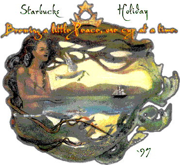
 | Holiday 1997 T-Shirt Entry FIRST PLACE This graphic was entered into the Starbucks 1997 Holiday T-shirt contest. It was a joint venture by myself and a fellow Partner Jeff Bows. Jeff did the artwork that was painted freehand. I then scanned the image, edited it and added the text. The contest was limited to plant Partners in the United States. There were two first place categories, one for the each plant and one overall. The overall winner got their image put onto sweatshirts that were limited to Partners of Starbucks. We came in First for the plant, so we got a monetary prize. Because of my employment with Starbucks Coffee Co., any graphic created that is related to the company or contains the company's name becomes their property. | |||
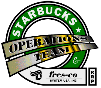
Operations Team Logo This was a logo designed while I was working with Starbucks Coffee Company. At the time, I was a member of the Operations Team. Working concurrently with Fresco Systems USA, this Team dealt with resolving issues and problems with coffee packaging machinery at the Kent Roasting Plant outside of Seattle, WA. While on the team I was asked to design a logo and the above was my contribution. The logo utilizes the familiar Starbucks round body, typeface and green/white/black color scheme. The overlapping white area on the bottom was for the Fresco logo which embodies the joint efforts of Starbucks Coffee Co and Fresco for efficient operation. The overall graphic is in the shape of a "Q" which stands for the continuously improving quality that the Team represents. The KRP block is a roasting plant denoter. KRP for the Kent Roasting Plant (Kent WA,) SRP for the Seattle Roasting Plant (Seattle WA,) and YRP for the York Roasting Plant (York PA.) | ||||
 | ||||
 | ||||||||
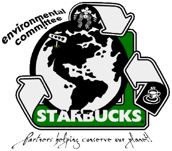
1999 Enviornment T-Shirt Entry This was a T-shirt design I did for the 1999 Starbucks Environmental Committee's Earth Day contest. This contest was limited to employee's (or in Starbucks lingo, Partners) currently working with the company. What was required was a full-sized, ready to print image. The judges gave no limitations on colour or creativity. The final image was big enough to be printed on the back of a shirt. Obviously the file size is too large to be rendered here so a smaller image was cropped for illustration. Since it was for Earth Day '99, I started with a blown up EPS image of the earth from a clip art CD collection. Next, some universal symbols for recycling were used to emphasis the premise. At the top of the world lies the Starbucks Siren within the first of three recycle arrows. This arrow points into the Starbucks green that flown down to the Starbucks name and into the next arrow on the left. This arrow not only stays with the recycling theme but it also points to the origin of the company (Starbucks started in 1972 at Pike Place Market in Seattle WA.) In Seattle sprouts the year denoter and some small coffee plants with 3 ripe red coffee fruit. The final arrow on the right points towards Earth to complete the 3 arrows of recycling. The shirt design was double sided. The above logo was for the back of the shirt while the small graphic below was to be printed on the front pocket area. It was made at about 3x3 inches and was done in the traditional Starbucks color scheme. The contest itself had more than 100 entries from Starbucks partners from the US and Canada. There were three winners made by the judges and unfortunately I didn't make it this time around. Its final resting place is here in my portfolio. =) | ||||||||
| ||||||||
